Tips to Hire The Right Interior Designer
by Adwords on April 05, 2022
The 60-30-10 rule is a useful decorating rule used by every professional interior designer that aids in the creation of a colour scheme for any interior design.
The rule indicates that the main colour of a room should make up 60% of the space, the secondary colour or texture should make up 30% of the space, and the accent colour or texture should make up 10% of the space.
As mentioned above, your room's predominant colour should take up 60% of the bedroom or living room design.
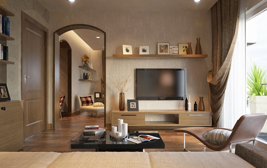
A living room's 60% would consist of the majority of the walls, large accent pieces such as area rugs, and possibly a sofa.
The concept is that the 60% hue anchors the area while also serving as a backdrop for other colours that follow.
The secondary colour accounts for 30% of your total interior design.
This colour will be used half as much as your main colour. Draperies, flooring, accent chairs, bed linens, painted furniture, or even a feature wall may well be examples of this.
The concept is that the secondary colour complements the main colour while still standing out and adding interest to the space.
The next step is to add an accent colour. This is when the real fun begins.
Your accent colour makes up 10% of the entire space.
This is where you put your throw pillows, decorative items, and artwork in the living room design.
Throw pillows on the bed, lights on the bedside table, and candles on the nightstand might all be examples of this in a bedroom design.
Your accent colour might be from a piece of artwork in the space or a printed fabric on bigger items.
The 60-30-10 method will make colour selection simple and help you attain décor harmony.
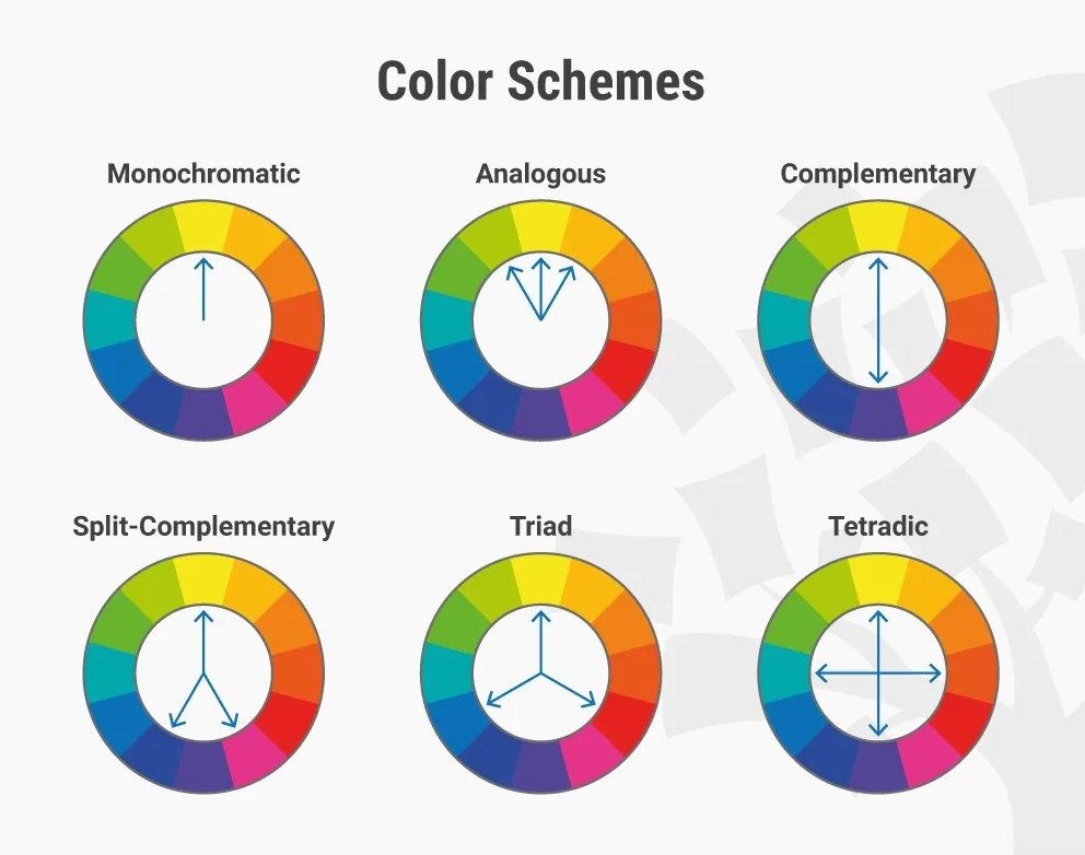
The simplest method for selecting the three colours for your room is to use a colour scheme based on the colour wheel.
Decorators also employ a simple approach of pulling colours from a fabric print because the fabric designer has already done the matching for you.

The simplest technique for selecting the three colours for your house or condo interior design is to use a colour scheme based on the colour wheel.
Choose only one colour for your bedroom design and utilise brighter and darker variants of that hue.
Most professionals recommend choosing a neutral hue like grey, cream, white, or greige for this.
Based on the colour wheel, you can choose two hues that are diametrically opposed.
One will always be a "warm" hue, while the other will be a "cool" colour, resulting in a harmonious balance.
Choose three colours on the wheel that are next to each other, with the centre colour being the most dominating.
Blue-green, green, and green-yellow are three examples of this.
With this style, you can choose the main colour, locate its complementary colour on the colour wheel across it, and add one of the colours next to the complementary colour.
For example, if your dominant colour is blue, your complementary colour could be orange, and your third colour could be red.
Whatever your reason for wanting to deviate from the 60-30-10 guideline, you may do so while still maintaining colour harmony in your house.
Learning the rules before breaking them has always been the cornerstone of any great creative effort.
So once you understand the fundamental principle of this rule, you can personalise it for your own spaces.
It's also a good idea to study the dos and don'ts of colour usage beforehand.
You can choose a 60% main colour and a 30% secondary colour, but instead of one 10% accent colour, you can choose two 10% accent colours.
When one accent colour isn't quite enough, you can always add that extra throw pillow or candle holder.

Instead of three distinct colours, a monochromatic colour scheme allows you to use varied shades of the same hue for the primary, secondary, and accent colours.
A neutral greige may be soothing as your 60% primary colour, a deep shade of the same greige may be lovely as your 30% secondary colour, and a soft shade of your greige may be refreshing as your 10% accent colour.
A colour scheme that is neutral and monochromatic is quite calming.
If you have a colour scheme in mind, go ahead and use it. Experiment with 30-30-20-20 or 40-25-15-10-10 if that ratio seems appropriate to you.
However, if you must break this design rule, pay attention to the colour balance in your interior design.
You may defy the rules and create a balance that appeals to you after you understand the visual weight of these colour combinations.
The 60-30-10 rule is a tried-and-true decorating method for quickly putting together a colour scheme for your house or condo interior design.
The proportions of 60%, 30%, and 10% are intended to balance the colours used in any room.
This concept is quite simple to implement when you’re familiar with the colour wheel.


